Marie Curie Rebrand
Marie Curie
We’re incredibly proud to have worked with Marie Curie UK to update their brand identity as part of their strategy to raise awareness of their work supporting people at the end of life, no matter the illness.
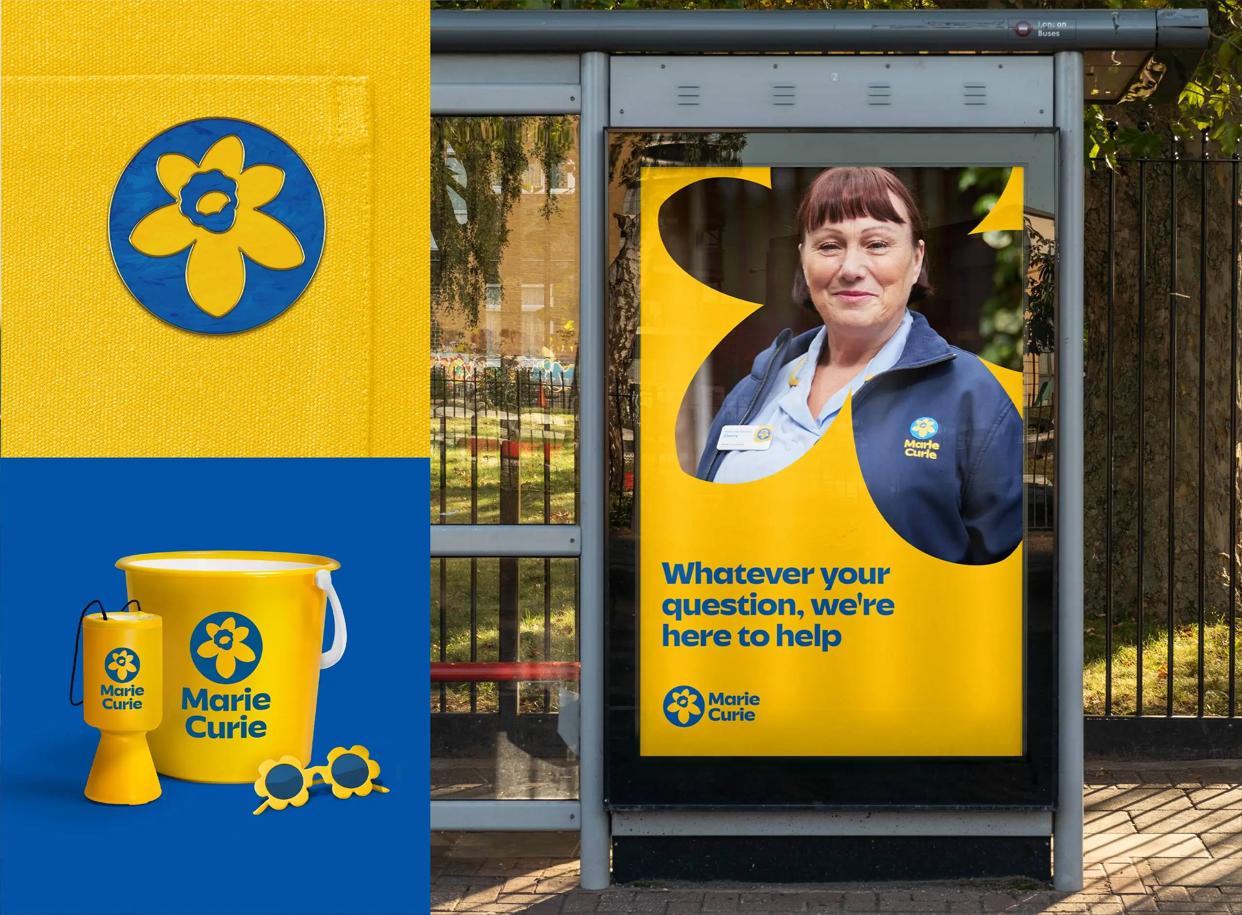
At the core is the iconic daffodil emblem and a bolder more ownable brand aesthetic to appeal to a broader audience. The inclusive visual identity touches every aspect of the brand and signifies the shift in mission and speaks to both the support and care Marie Curie offers at end of life, but also to the brighter and more equitable future they campaign for every day.


